Business Problem
My Role
Final Outcome
"Saiyam's contribution towards key features and his ability in highlighting the details in designs and setting up the synchronous flow for our smartwatch project has truly helped in developing and finalizing the UI requirements and have been widely appreciated and accepted within the department"
-Client Feedback
Understanding The Mobile Dashboard
The dashboard was the hero section of the application which greets the user. The functionality of the dashboard can be divided into four visual sections.

Basic Indicators
Car Model
Remote Operations
Tab Bar
Shrinking the design to a Smartwatch
All this information on the mobile dashboard had to be shrunk down to a watch screen. There were negotiations to whittle it down to the absolute essentials.
The result was a two screen navigation, where the main screen has the basic vehicle indicators and the second screen had the nav bar options with their own sub menus. The Remote Operations tab was converted into a single button with its own sub menu.

You can do all that with your watch!
There were multiple functions within the app, which can be operated remotely by user with their smartphone or smart watch, these functions are referred to as "REMOTE OPERATIONS" within the app.
There were six major remote operations (as listed below). Out of the 6, my work centred mainly around two functionalities: AC and Charging. For the ease of the case study, I will be primarily focusing on the AC remote operation from here on.

AC

Head Lights

Lock

Hazard
Vehicle Health

Charging
Lets turn the AC on!
The AC user flow involved several variables, so my initial approach was to map the happy path with the client and BA for quick validation.
The journey demanded multiple user inputs—A/C, Defroster, Rear Defogger, Seat Ventilation—plus time and temperature settings. On a smartwatch, the lack of step visibility made this especially challenging.
My role was to streamline the experience, despite the client’s non-negotiable requirement that visual design remain largely consistent across mobile and watch. This constraint led to several rounds of iteration to strike the right balance.
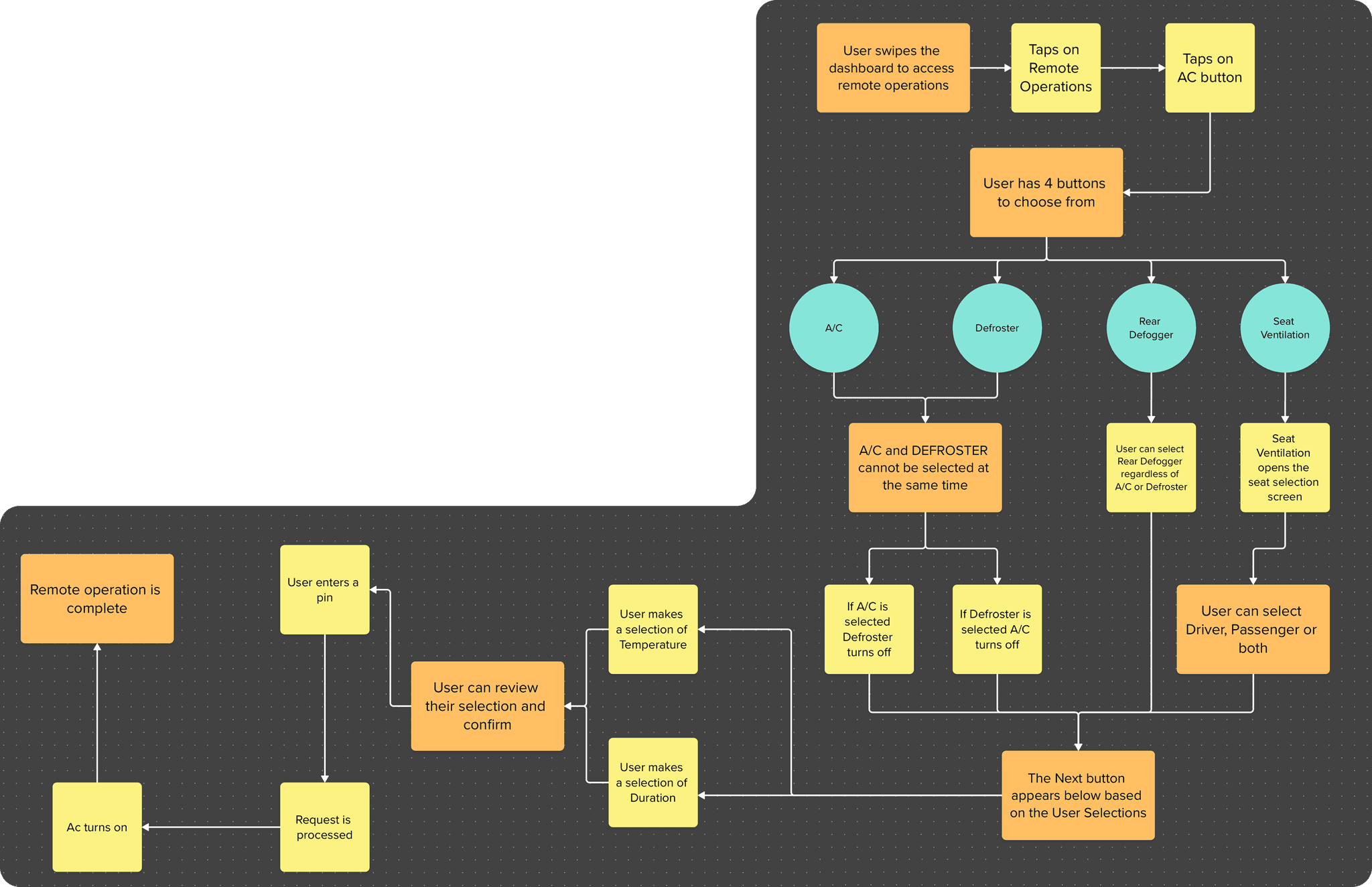
Preparing for every scenario
This is an overview of all the scenarios that were created for AC. This included failed states alternative flows(for eg: defroster) and turning AC off. In total there were around 10 user flows each that were built for WatchOS and WearOS.

Lets find the best way to set you A/C temperature
One key opportunity for streamlining was the picker screen. Instead of using two separate screens for Temperature and Time selection, I combined them into a single, intuitive interface using native WatchOS and WearOS components.
This approach required deep research into both platforms’ design systems, along with multiple feasibility discussions with developers to ensure performance and usability.
As the client prioritized WatchOS optimization, all design exploration began there—setting the foundation for a scalable solution across both ecosystems.
Watch OS
Option 1
Option 2
Option 3
Wear OS
Option 4
Option 5
Option 6
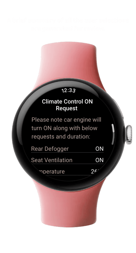
Final Air Conditioning User Flow
This was the finalized happy path for activating the A/C on both WearOS and WatchOS platforms. A primary constraint was maintaining visual and structural parity with the existing mobile design system—any deviation risked increasing development time and cost significantly.
To address this, I adhered closely to Google’s “One task per screen” philosophy, optimizing for glanceability and reduced cognitive load, while preserving consistency with the established design language. This balance of UX integrity and technical feasibility was key to driving alignment across design and engineering teams.
Wear OS
Watch OS
A simplified version of the flow


Just the beginning
My contributions to the project led to a noticeable boost in app ratings—up by 18% on WatchOS and 21% on WearOS post-launch. As more of the user flows I designed continue to go live, both business and customer feedback remain strongly positive.
This was one of my first client-facing roles at IBM, where I gained deep, hands-on experience with design systems, platform-specific responsiveness, and cross-platform scalability. It also marked the beginning of my journey into implementing motion design to enhance user engagement and usability.

Playstore: 4.5